Microinteraction Studies
This is an ongoing personal project exploring how motion is used in user experience to clarify hierarchy and provide feedback through microinteractions. In these experiments, I consider how timing, choreography, and different types of motion can affect usability. I designed bits and pieces of a weather app as a vehicle for these studies.


Normal 1x Speed
Slow 3x Speed


Study No. 1: Hierarchy
Accordion
This example examines motion used in expanding and collapsing accordions, and how the animation helps clarify the parent-child relationship between the original element and the expanded content.
The primary consideration for this study was the duration and ease for both the expand and collapse of the container. While it was tempting to linger on the animation, I ultimately decided to limit the duration to 250ms in and 200ms out to achieve a more productive effect. To avoid sluggishness, I chose to use a 20% ease out, and 80% ease in (bezier curve: 0.20, 0.00, 0.20, 1.00) for both the expand and collapse.
Other considerations include how the weather details and hourly forecast in the expanded card animate in. To reinforce the downward direction of the expansion, I added a subtle y-axis animation in tandem with a quick fade in. The two sections animate in one after another, with a 33ms delay.
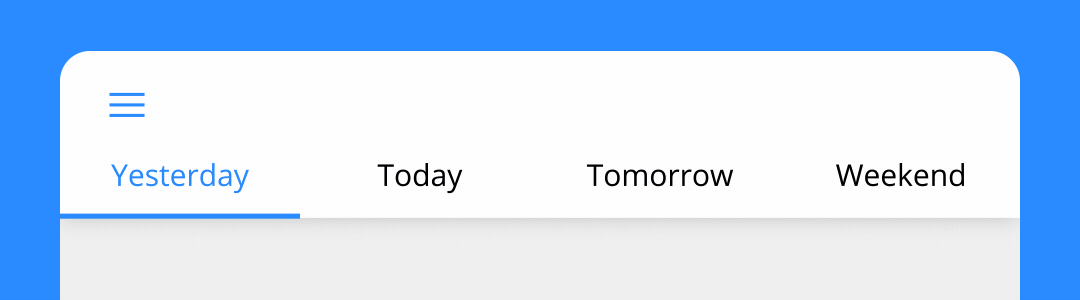
Study No. 2: Navigation
Tab Menu
In this example, I wanted to examine the choreography involved in navigating a tab menu. Rather than happening all at once, each element triggers the animation of the subsequent element, beginning with the visual tap feedback, then the color cross-fade of the text, and then the following underline that reinforces that status change.
Because the initial tap animation is quite efficient and gives immediate feedback to the user, it allows more freedom for the tab underline to animate in. I gave the underline subtle stretch at the peak velocity of its motion, an small expressive touch that reinforces its motion curve. I also allowed it a stronger outgoing and incoming ease (bezier-curve: 0.30, 0.00, 0.00, 1.00), compared to the container transform above.
Study No. 3: Notification
Severe Weather Alert
Motion can often be distracting, since it easily draws attention to an otherwise static page. While it’s important to be conscientious how motion may negatively affect user experience, motion can also used to the advantage of situations such as alerts that require immediate attention. I created a looping bounce animation for a severe weather notification with the intention of catching the user’s attention through persistent motion.
Study No. 4: State Change
Toggle
This was a playful experiment in toggle states. I was interested in creating a faux-3D look with 2D elements. The ultimate effect changes the traditional sliding motion of a toggle switch to a flip or roll.